YA Cover Changes - Love It or Hate It? List!
Hello, everyone! I'm back, and I'm here to discuss cover changes. It happens sometimes when a book comes out in paperback, or in mid-series, or when a series needs a revamp. I'm going to list some of cover changes that I find amazing, confusing, and downright awful. Now, I'm not counting movie tie-ins, but everything else is fair game. It's time to do what everyone tells us not to. Let's judge some books by their covers.


Let's start off with the classics. That's right. It's Harry Potter. They've just had a recent book cover redo to go along with their 15 year anniversary. It was a bold move on their part. The first covers are considered icons, but I have to say that they did a pretty good job with the new covers. I like the overall style. There's a definite difference between the two, but I think they both convey the magic of the books quite well. Plus, the spines of the new covers look so magical on any bookshelf.

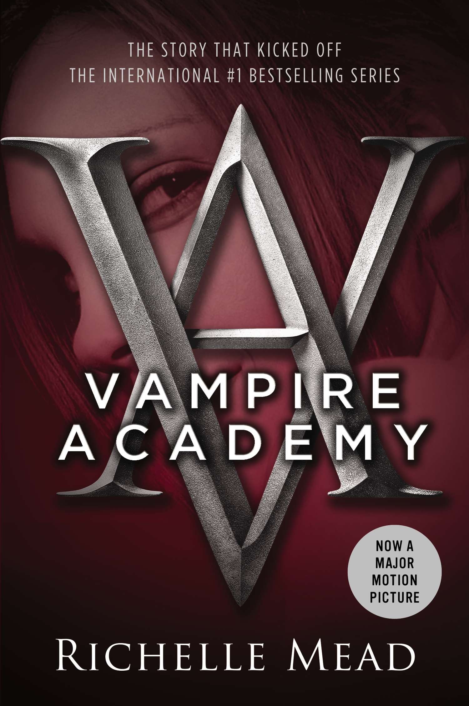
Up next we have the Vampire Academy Series. To be fair, the original Vampire Academy covers were a bit dated. To me, they look a bit like oddly constructed 90s covers. That's not saying that the new covers are much better. Now that all look the same but in different colors. Then you have the girl's face in the background, and, of course, we've never seen that before. The first covers may have been strange, but at least they had some originality.


One change that I really appreciated happened mid series for the Throne of Glass series. The first cover that they had didn't quite peg the feel of the book. The girl on the cover doesn't scare me the same way Caleana did. The other cover looks dangerous, and it's something that I haven't seen before. In case you haven't gotten it, I much prefer the newer covers over the old.
Now, all the books that I'm about to list I haven't read yet, but they're on my "To Be Read" list. I will be judging this books on their looks and how they compare to the summaries and how likely it would be for me to buy them.


So Stephenie Perkins gets her own category, and this is going under "Thank God for Cover Redesign." The first cover doesn't seem to have much depth. It tells a surface story. From the summaries, I'm getting so much more, and I think the new designs reflect that. Plus, they look so darn pretty. I mean, they've got to look good on my bookshelf, right?



Up next is Across the Universe Series. The premise of book sounds really amazing, which is why its on "To Be Read" list. Now, the book with the two silhouettes doesn't actually represent the book. It looks like a destined love story rather than a spaceship scifi mystery. I like the one with the girl in the mechanical eye. It says "YA Scifi" without it being the standard YA cover heroine. The other one with the bold title isn't terrible, it just doesn't have detail as the other one. So while the silhouette cover is more aesthetically pleasing, I like the other two for this particular book.

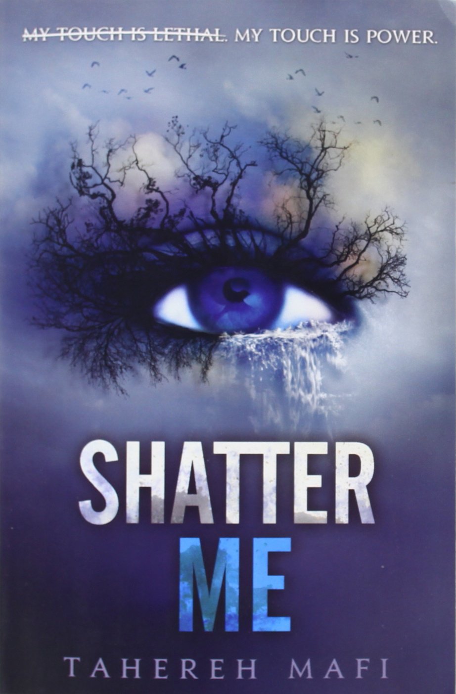
Speaking of girls in fancy dresses, thank goodness for the redesign for the Shatter Me series. They start the series out with a girl in a fancy dress standing in the wind. Granted they did make it a little less cliche with the background effects and sparkles. Even still, the design didn't really stand out among other YA covers. While I have seen eyes on other cover, they've never been this detailed or distinctive. I don't know how much they pertain to the plot, but I'd still buy the book.
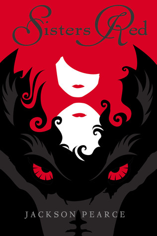

Last but not least, we have the Fairytale Retellings series. Again, was a series that really needed an upgrade. It's not so much that the original covers didn't depict the story, at least according to the summaries, but it just didn't seem special. It didn't seem that someone really thought about how to design it. Sisters Red is just an ax in a forest with a bright light. The new one isn't just beautiful. It also gives the major players, the sisters and a wolf. The way that the hair and the wolf mix into each other is brilliant. Stellar redesign.
With everything said and done, we do tend to judge books by their covers. It's what attracts us to them in the first place. It's why book selfies are becoming popular and book shelves are becoming more beautiful. Book designers are becoming more and more important, and are able to show their creativity through their work. And we'll still be here judging them. So go ahead with your redesigns, but try to make all books in a series match. Please. For my sanity.
That's it for this post! Comment down below on some other cover changes that you found noteworthy. Subscribe to the blog by adding your email to the Subscribe Box down below. Add me to your circles by clicking the Google+ button off to the right. Follow me on twitter @KK_Donna_Blog for ridiculousness about my life and up to date information about the blog. Follow the tumblr dedicated to the blog, which you can find at this link. Read on, lovelies! I'll see y'all next post!


Let's start off with the classics. That's right. It's Harry Potter. They've just had a recent book cover redo to go along with their 15 year anniversary. It was a bold move on their part. The first covers are considered icons, but I have to say that they did a pretty good job with the new covers. I like the overall style. There's a definite difference between the two, but I think they both convey the magic of the books quite well. Plus, the spines of the new covers look so magical on any bookshelf.


Up next we have the Vampire Academy Series. To be fair, the original Vampire Academy covers were a bit dated. To me, they look a bit like oddly constructed 90s covers. That's not saying that the new covers are much better. Now that all look the same but in different colors. Then you have the girl's face in the background, and, of course, we've never seen that before. The first covers may have been strange, but at least they had some originality.


One change that I really appreciated happened mid series for the Throne of Glass series. The first cover that they had didn't quite peg the feel of the book. The girl on the cover doesn't scare me the same way Caleana did. The other cover looks dangerous, and it's something that I haven't seen before. In case you haven't gotten it, I much prefer the newer covers over the old.
Now, all the books that I'm about to list I haven't read yet, but they're on my "To Be Read" list. I will be judging this books on their looks and how they compare to the summaries and how likely it would be for me to buy them.


So Stephenie Perkins gets her own category, and this is going under "Thank God for Cover Redesign." The first cover doesn't seem to have much depth. It tells a surface story. From the summaries, I'm getting so much more, and I think the new designs reflect that. Plus, they look so darn pretty. I mean, they've got to look good on my bookshelf, right?


Up next is Across the Universe Series. The premise of book sounds really amazing, which is why its on "To Be Read" list. Now, the book with the two silhouettes doesn't actually represent the book. It looks like a destined love story rather than a spaceship scifi mystery. I like the one with the girl in the mechanical eye. It says "YA Scifi" without it being the standard YA cover heroine. The other one with the bold title isn't terrible, it just doesn't have detail as the other one. So while the silhouette cover is more aesthetically pleasing, I like the other two for this particular book.


Speaking of girls in fancy dresses, thank goodness for the redesign for the Shatter Me series. They start the series out with a girl in a fancy dress standing in the wind. Granted they did make it a little less cliche with the background effects and sparkles. Even still, the design didn't really stand out among other YA covers. While I have seen eyes on other cover, they've never been this detailed or distinctive. I don't know how much they pertain to the plot, but I'd still buy the book.

Last but not least, we have the Fairytale Retellings series. Again, was a series that really needed an upgrade. It's not so much that the original covers didn't depict the story, at least according to the summaries, but it just didn't seem special. It didn't seem that someone really thought about how to design it. Sisters Red is just an ax in a forest with a bright light. The new one isn't just beautiful. It also gives the major players, the sisters and a wolf. The way that the hair and the wolf mix into each other is brilliant. Stellar redesign.
With everything said and done, we do tend to judge books by their covers. It's what attracts us to them in the first place. It's why book selfies are becoming popular and book shelves are becoming more beautiful. Book designers are becoming more and more important, and are able to show their creativity through their work. And we'll still be here judging them. So go ahead with your redesigns, but try to make all books in a series match. Please. For my sanity.
That's it for this post! Comment down below on some other cover changes that you found noteworthy. Subscribe to the blog by adding your email to the Subscribe Box down below. Add me to your circles by clicking the Google+ button off to the right. Follow me on twitter @KK_Donna_Blog for ridiculousness about my life and up to date information about the blog. Follow the tumblr dedicated to the blog, which you can find at this link. Read on, lovelies! I'll see y'all next post!
Comments
Post a Comment